

Vendredi 28 janvier 2011, 15h-17h, Musée de Pully et MUDAC de Lausanne, exposition de papiers peints contemporains. Olaf Nicolai, 2001, Musée de Pully (avec un très bel araucaria dans le jardin). Mai Thu Perret, 2008, MUDAC. Dossier de presse : http://www.mudac.ch/media/uploads/press/papiers-peints/DPfaceaumur.pdf
Catégorie : Exposition
Panoramiques
Vendredi 28 janvier 2011, 12h. Château de Prangins, Musée national suisse, exposition de papiers peints.
On y découvre non seulement les luxueuses impressions à la planche et les motifs à l’antique typiques du tournant du XVIIIe siècle, mais aussi les rouleaux industriels de la Belle Époque, avec leurs motifs historicisants ou Art nouveau. Sans oublier les célèbres panoramiques, une des formes de décor intérieur les plus appréciées de tout le monde occidental vers 1800-1850, dont la Suisse fut un motif de prédilection. À titre d’exemple, la Grande Helvétie et la Petite Helvétie rappelleront que si notre pays n’a quasiment pas fabriqué de papier peint, il a servi d’inspiration pour des créations exportées dans le monde entier.
(Texte officiel…)


Papier peint panoramique la Petite Helvétie dessiné par Antoine-Pierre Mongin en 1815-1816 pour la Manufacture Jean Zuber à Rixheim (Mulhouse), vendu jusqu’en 1871.
Voir : document sur les panoramiques de Zuber au Musée du papier peint de Mulhouse.
–

Vendredi 28 janvier 2011, 13h. Château de Prangins, Musée national suisse, calèche dont les sièges sont tournés vers le paysage (panoramique, ou plutôt, travelling).
Uncanny (Tony Oursler)


Vendredi 14 janvier 2010, galerie JGM, 79 rue du Temple, Paris 3e. Deux des pièces de Tony Oursler. La première, sculpture en verre, ampoule électrique, sans cartel, qui peut se rapporter au texte ci-dessous et la deuxième, Million Miles (Orbital Screw), 2007, fibre de verre, projection vidéo.
In the age of spectacle the struggle to assign meaning to the endless procession of images and the technology which presents them the viewer may morally polarize elements of the system. Claims of good and evil have always accompanied the development of any technological innovation. Regardless of the source of spectacle; TV, hollywood, or the internet these mimetic systems can be seen as amplifiers of human drives and as site of psychological projection on the part of the viewer. The personification of fears, as in the appearance of the devil in relation to the evils of technology. Technology can be seen as the fear of the unknown and thus as a mirror of the viewers fear of their own potential. In this installation I trace this human tendency throughout a loose media time line. Early graphic representations of the camera obscure often included depictions of demons, I used these images as a starting point in the popular depiction of the devil. From these simple horned figures, with the help of glass artist Jonathan Christie, I have create transparent hand blown glass devils which act as sculptures as well as lenses for this installation. These glass figures are also mapped into a computer graphics system and animated to be included in the installation. Voir : ici.


Depuis août 2010 et jusqu’au 1er août 2011, l’exposition virtuelle de Tony Oursler, Valley, à l’Adobe Museum of Digital Media. Page d’entrée et espace interactif « Special Interests ». À visiter : ici.

Tony Oursler
Une décompression

Mercredi 29 décembre 2010, 15h37, vue à travers la vitrine. Fabien Giraud et Raphaël Siboni, La Condition, 2009, châssis de voiture compressée, 340 x 170 x 120 cm, production Le CENTQUATRE, Courtesy galerie Loevenbruck, 6 rue Jacques Callot, Paris 6e. http://www.loevenbruck.com/
« Nous n’avons pas grandi dans une époque mais dans une condition. Le temps était un processus. Les espaces étaient des dispositifs. La Condition est le nom par défaut de ce présent d’avant. »
F.G. & R.S.
« Deux voitures compressées, décompressées à la main, sont extraites du flux du monde et se présentent comme une réflexion sur la sculpture même : dans ce paysage liquide d’infinies variables, quand et comment produire un événement ? »
Claire Deltheil
Voir « Coucher de soleil », 15 avril 2010 : https://jlggb.net/blog2/?p=1853
De la bibliothèque : Andy Warhol, Stockholm, 1968
Catégorie « De la bibliothèque ». Dossier N°1 réalisé le jeudi 23 décembre 2010.


Sur cette photo par Billy Name, Viva (Janet Susan Mary Hoffmann) et Piero Gilardi (voir : http://jlggb.net/blog/?p=5658 et https://jlggb.net/blog2/?p=2595)

Phrase d’Andy Warhol (avec traduction en suédois), page 10.
Andy Warhol, ouvrage conçu par by Andy Warhol, Kasper Konig, Pontus Hulten et Olle Granath (conservateur du musée — Billy Klüver a aussi contribué à l’exposition), Moderna Museet, Stockholm, février-mars 1968, 21 x 27 cm, environ 500 pages (elles ne sont pas numérotées) dont 15 pages de texte. Édition originale, imprimée à Malmö en 1968. Malheureusement, l’emboîtage en carton a été perdu dans un déménagement. Comme dans tous les exemplaires connus, la reliure (pages collées sans couture) est en train de céder : certaines pages sont détachées (depuis, une nouvelle technique de colle permet les livres à la fois très épais et très souples, comme dans les collections « Bouquins » ou « Quarto »). Mais c’est une rareté, malgré son tirage massif (on l’annonce de 800 à 1600 euros dans les librairies de livres d’artistes). Plusieurs des aphorismes prêtés à Warhol proviennent de ce catalogue, dans ce beau caractère (Falstaff de Monotype, 1931). Le livre entier est imprimé en typographie sur rotative, ce qui donne aux photographies un rendu et un toucher étonnants, sur un papier frictionné très fin de magazine. Ce livre est resté pour moi la référence absolue d’un « album », où les photos s’enchaînent sans légendes, une par page.
Ce catalogue a été réédité en 2008 à l’occasion de l’exposition du quarantenaire à Stockholm :
Andy Warhol
Other Voices, Other Rooms
9 february – 4 May 2008
Willem de Rooij on Andy Warhol
Text from the catalogue. Written after telephone conversations with Kasper König and Olle Granath, 3 and 4 September 2007
Andy Warhol’s first European museum solo show took place at the Moderna Museet in Stockholm from February through March 1968. Pontus Hultén curated the exhibition together with Olle Granath. The exhibition came with a catalogue that was, like the show, named ‘Andy Warhol’.
Kasper König, who worked for the Moderna Museet as an intern of sorts in New York, developed a basic concept for the book. Reading Warhol’s work in the context of On Kawara and other conceptual contemporaries, König had produced a radical grid that consisted of four groups of images: one group documenting Warhol’s artworks, two groups documenting Warhol’s social and professional milieu, and one group documenting a selection of particularly outraged Warhol reviews clipped from provincial American newspapers. After Warhol had given his approval to this first proposal, König proceeded to create a dummy. Ivan Karp, who worked with Warhol’s dealer Leo Castelli, gave König access to their documentation archive. König produced a sequence of pages on the gallery’s Xerox machine that mimicked as well as documented Warhol’s work: many of the available images were photocopied by König several times, and ended up in the book as self-elaborations. Thus a repetitive structure was created that expands beyond Warhol’s (serial) artworks. Here is where the book started to become a piece (a multiple) rather than a catalogue, because the mode of production as well as the formal outcome mirrored procedures and politics that were at work at the Factory at the time. In the final version of the book, only Karp’s original documentation images are titled; König’s photocopies are not. Most of the works documented in this first image section were not shown in Stockholm; they merely served as source material.
For the second and third sections of the book König commissioned Billy Name, chronicler and inhabitant of the Factory, and Stephen Eric Shore, a teenage Warhol groupie at the time. Both Name and Shore composed rhythms of their own sequences, and neither of them added any captions: they felt the images should speak for themselves. This absence of text contributed to the object-status of the book.
Name’s sequence consists of 274 images, each bleeding off an entire page. The sequence functions as a record of how Warhol and his collaborators lived, worked and celebrated, in – and outside the Factory. Most of the images have an informal character, like snapshots. Many are overexposed, unfocused or tilted, making for a visual dynamic that derails into a delirious storyboard. This series too, can be seen as an autonomous (time-based?) piece, more than a documentary exercise.
Shore’s sequence consists of 170 images, one per page. His images are more formal in their framing than Name’s. In comparison his approach seems detached, his images of the Factory uncharacteristically quiet and concentrated. Each image is reproduced in its entirety, the edges of the negative emphasized by white borders. Shore’s se-quence thus reads like an exhibition, not like a single piece.
When König returned his dummy to the Factory, Warhol scrutinized it carefully but made only a small number of changes. Contrary to what Warhol wanted to be popular belief, those who produced input at the Factory were carefully monitored.
The final edits on the dummy were made in Stockholm by Olle Granath. He compiled a small selection of Warhol quotes and aphorisms from a stack of books and clippings collected by Hultén and placed them in the book as an introduction before the image sections. The graphic design was by John Melin and Gösta Svensson. Melin produced the typography in a style he had previously used for the Moderna Museet’s catalogues and posters. Because the idea was to print a large edition (eventually: 200.000), for a low price (eventually: $1), Andy Warhol was printed like a newspaper on the rotary presses of the Sydsvenska Dagbladets; an additional signed deluxe version with gilded fore-edge was produced in a small edition. The newsprint used was not only cheap, but also gave the book an ephemeral quality that appealed to the editors. All images are rendered in black-and-white, except the cover, on which a flower motif derived from Warhol’s paintings is printed in five colors. The envisaged press-clippings section had to be dropped: the book would have become too heavy to be efficiently stored at the distributors.
The exhibition in Stockholm attracted a relatively small number of visitors, due to the extremely cold winter, but also to the fact that leftist radicalization increasingly drove the Museets public to mistrust anything American or consumerist. There was no space yet for a more complex reading of Warhol’s relation to consumption. The book, however, became very popular: its enormous edition allowed it to be distributed in nightclubs and record stores, not only museums. A timeless update on the latest from New York, it first became a cult object, then a collector’s item.
Ce texte provient du site du Moderna Museet de Stockholm :
http://www.modernamuseet.se/en/Stockholm/Exhibitions/2008/Andy-Warhol—Other-Voices-Other-Rooms/Willem-de-Rooij-on-the-Andy-Wa/
Palais de la découverte

Lundi 6 décembre 2010, 17h. Au Palais de la découverte (Grand Palais à Paris), ce qu’il en reste, très peu, des démonstrations avec appareils qui faisaient son charme. Ici, un « carillon électrostatique » de 12 000 volts, qui met en jeu la proximité initiale de la boule du plateau de gauche pour établir un va-et-vient de cette boule.
Le pin et la souris

Lundi 29 novembre 2010, vers 10h. Taipei Fine Arts Museum, exposition « Time Unfrozen, From Liu Kuo-Sung to New Media Art ». Vidéo par Wu Chi-Tsung (Taiwan), 01-Pine, 2008. L’œuvre cherche à introduire le temps effectif dans la peinture classique. Probablement un contresens. Le gardien vient me dire que je ne dois pas photographier. Mais je m’intéresse au curseur Apple qui traine en haut à droite.
Video installation taoïste

Lundi 29 novembre 2010, vers 10h. Taipei Fine Arts Museum, exposition « Time Unfrozen, From Liu Kuo-Sung to New Media Art ». Installation vidéo par Hung Keung + imhk lab (Hong Kong), Dao Gives Birth to One, 2008.
Le pavillon des Rêves

Lundi 29 novembre 2010, vers 9h. Tapei, The International Flora Exposition, pavillon des Rêves, panorama final.
Ombres d’André Kertész
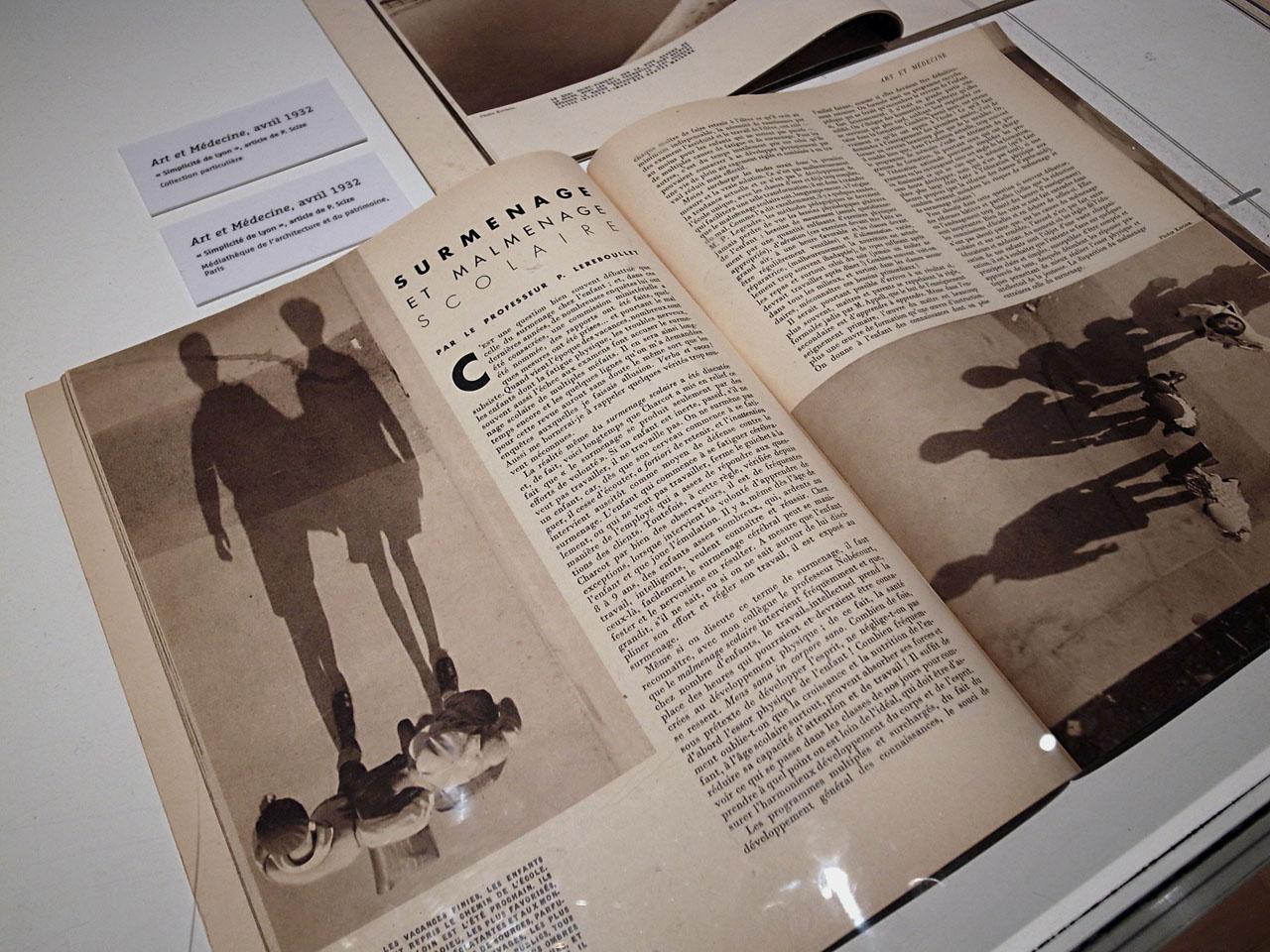
Dimanche 7 novembre 2010, 16h30, revue Art et Médecine, 1932, « Surmenage et malmenage scolaire », photographies d’André Kertész, rétrospective Kertész au Jeu de paume.
Voir : http://www.jeudepaume.org/index.php?page=article&idArt=1187&lieu=1
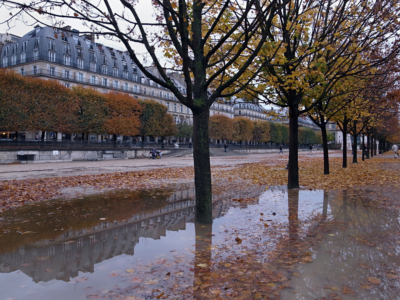
Photographies sous l’influence d’André Kertész, Galerie du Jeu de paume, jardin des Tuileries.